brand
How to use the logo, colours, type and voice. The files are at the bottom of the page.
the idea
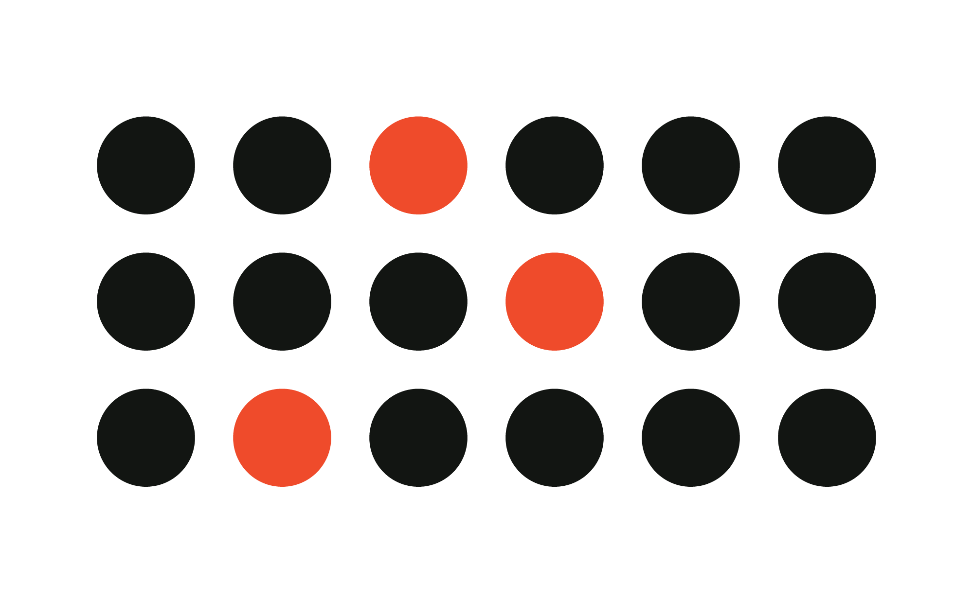
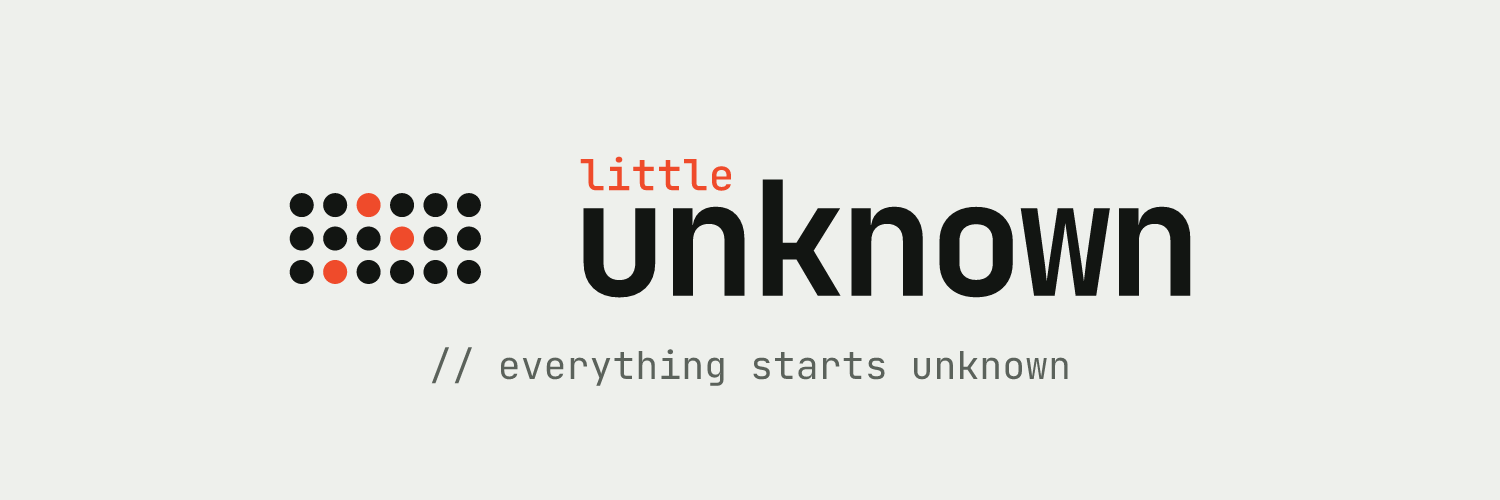
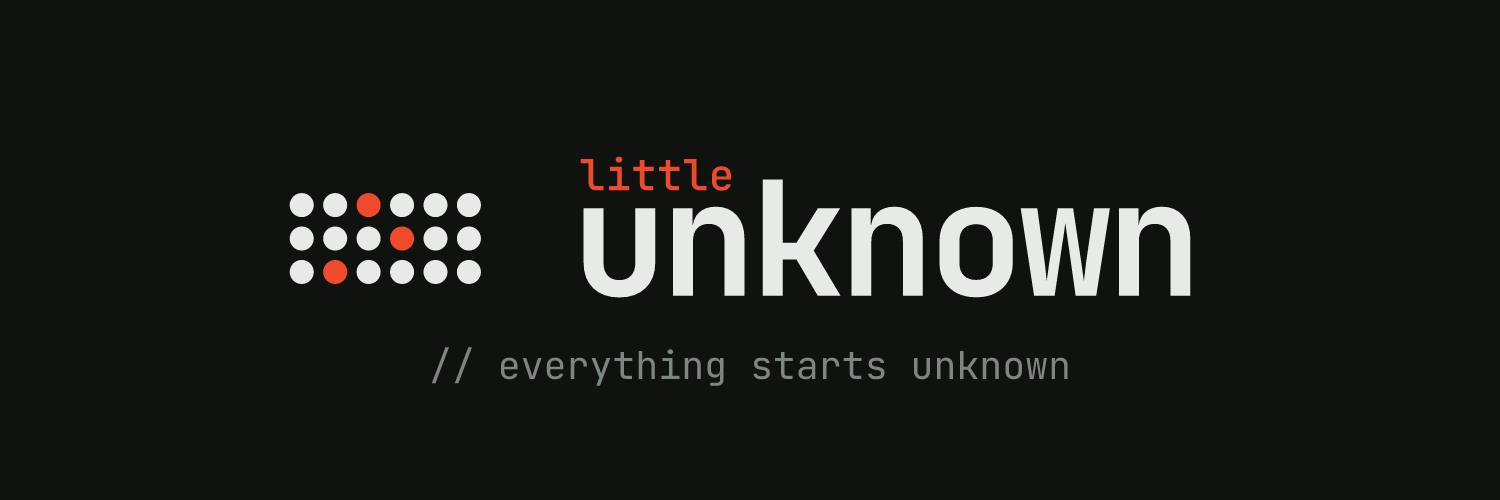
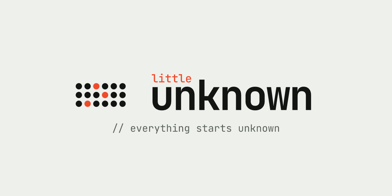
The dark dots stand for what's already known. The three lit ones are little unknowns, the questions we build products around.
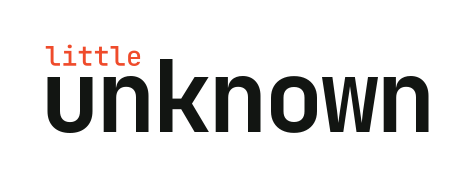
In the wordmark, little sits in the empty space above the "un" of unknown, so the small word fits inside the big one.
logo
motion
// everything starts unknown
tagline · titles and outrosusing it
clear space
Keep empty space around the logo at least the height of the dot band on every side.
minimum size
The full logo: 120px wide on screen, 30mm in print. The mark alone: 24px.
small sizes
Below 24px, use the simplified mark of six dots with one lit. It's also the favicon.
motion
On screen, the lit dots can pulse gently, one after another. Nothing else in the logo moves.
colour
- paper
#eef0ecbackgrounds - ink
#121512text, the known dots - vermilion
#ef4b2bthe lit dots, "little", one accent - vermilion deep
#bf3618links and small text on light - night
#0f120fdark backgrounds, app icon - moon
#e6ebe5text and dots on dark - graphite
#5b625bsecondary text, // comments
type
JetBrains Mono
Bold 700the wordmark and headings
Medium 500"little" and emphasis
Regular 400labels, navigation and // comments
IBM Plex Sans
Regular 400 and Medium 500paragraphs and anything meant to be read at length
Labels can be lowercase. Secondary lines start with // in graphite.
voice
Write the way you'd explain it to a friend.
- 01Keep sentences short and say what a thing does.
- 02Write in the present tense, as a studio that has shipped work.
- 03Don't call the products small or side projects. "Little" describes where an idea starts.
- 04Leave out hype words such as revolutionary, seamless and empower.
- 05Say each thing once.
in the world
littleunknown.com
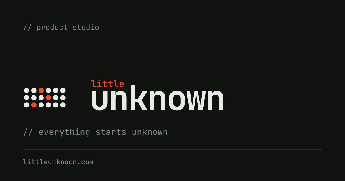 link preview
please don't
- 01Don't recolour the dots, or light more or fewer than three.
- 02Don't rearrange the dots or move the lit ones.
- 03Don't move "little" out of the space above "un". Set it in vermilion, or in night when the background is vermilion.
- 04Don't set the wordmark in another font, stretch it, or add shadows, outlines or gradients.
- 05Only place the logo on paper, white, night or vermilion, and never on a busy photo.
downloads
- Logo, for light backgroundssvgpng
- Logo, for dark backgroundssvgpng
- Logo, one colour, on vermilionsvgpng
- Mark, for light backgroundssvgpng
- Mark, for dark backgroundssvgpng
- Wordmark, for light backgroundssvgpng
- Wordmark, for dark backgroundssvgpng
- App icon, 1024 × 1024png
- Simplified mark, for small sizessvg











Social banners
- LinkedIn profile background, 1584 × 396lightdark
- LinkedIn company page cover, 1128 × 191lightdark
- X header, 1500 × 500lightdark
- Instagram post, 1080 × 1080lightdark
- Instagram story, 1080 × 1920lightdark
- Facebook cover, 1640 × 624lightdark
- YouTube channel art, 2560 × 1440lightdark
- GitHub social preview, 1280 × 640lightdark




The text in every file is converted to outlines, so you don't need the fonts installed.